Statistics is the process of converting data into information that is usable to people. Collections of numbers are difficult for people to make sense of directly. Statistics is a collection of tools that help people understand the meaning of quantitative data. These tools can compare datasets to see how similar they are to one another, how internally consistent the data are, and the characteristics of the data.
Statistics’ One Big Idea: The Normal Curve
If there is one big idea to understand in statistics, it is the normal distribution or normal curve, sometimes also known as a bell curve, which shows how a group of numbers is distributed. It turns out that natural phenomena such as age, height, and pretty much any other attribute have similar distributions of values. There are a few small ones, lots of ones in the middle, and a few large ones.
For example, if we want to see how a group of people vary in height, we would measure each one and graph their heights as shown in the graph below:
At the extremes, there are not too many people shorter than four feet or taller than seven feet, with most people around the middle. How these numbers vary from low to high is called their distribution. More precisely, it is a distribution of their frequency or number of times they occur in the dataset. The average of all these heights is between 65 and 70 inches, and the majority of the people cluster there.
If we were measuring people in Sweden, we would expect to see more people on the right, and if we measured in Peru, we would see more people to the left, but the overall shape would be similar: less on the ends and the majority around the middle. Because so many natural attributes follow this distribution shape, we can use the curve to predict values.
The Standard Deviation
The standard deviation (SD) is a measurement of how much variability there is in a dataset. This is measured by seeing how far each individual value is from the mean average, and it gives a good clue about whether the average is representative of all the members of the dataset.
A high SD means there are a lot of values higher and/or lower than the average, and knowing the average value will not be as helpful in predicting any particular value. A low SD means that all the values are close to one another, and the mean average is likely to be close to any given value.
For example, if we were to measure the SAT scores of a group of Ivy League students, we would expect their scores to be close to the average and the standard deviation to be low. The SAT scores of a high-school class are likely to be more varied and to diverge from the average, yielding a high SD.
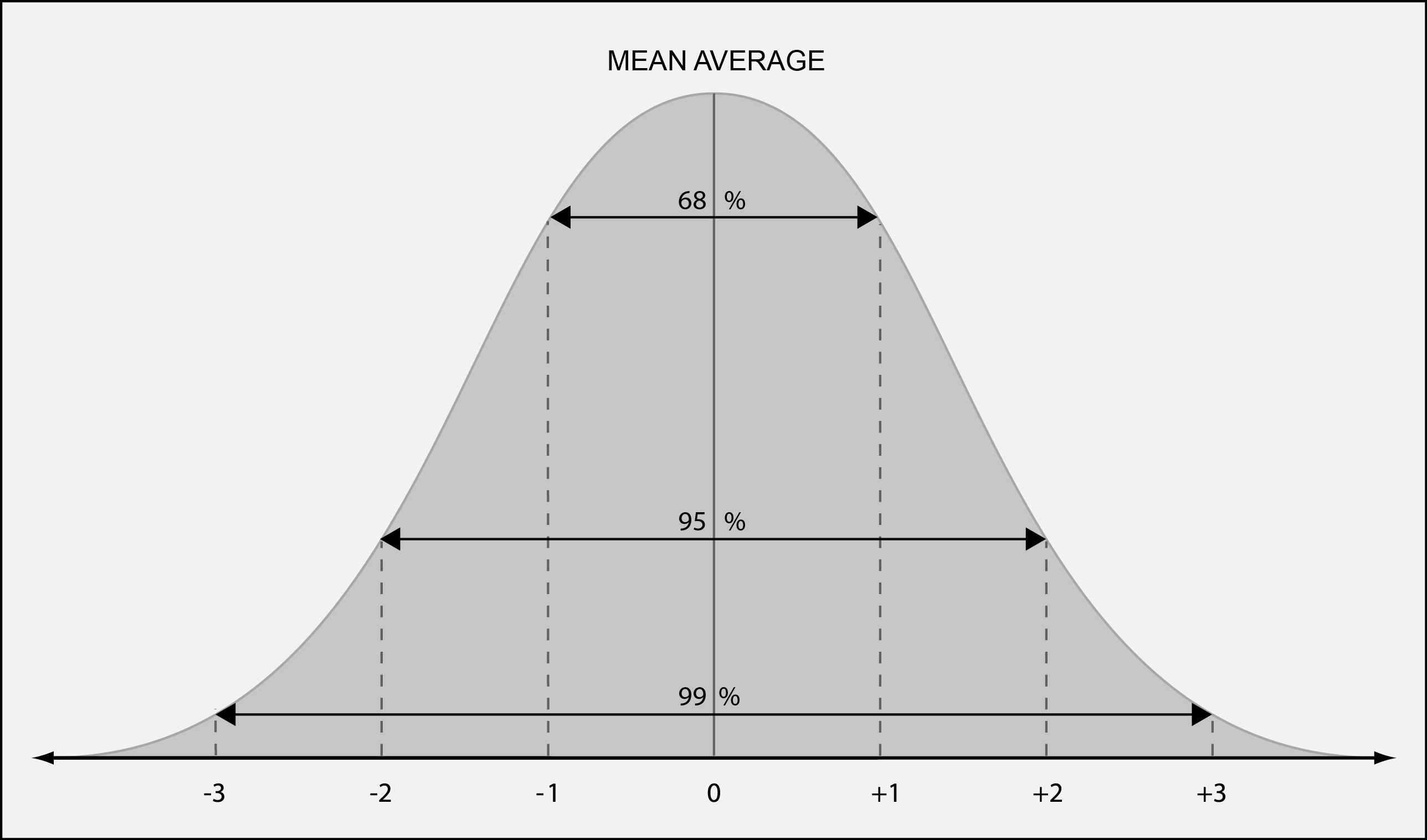
As an example, intelligence quotient (IQ) tests have a mean average score of 100 points and a standard deviation of 15 points. This means that 68 percent of people scored between 85 and 115 on the tests (±1 SD), that 95 percent of people score between 70 and 130 on the tests (±2 SD), and 99.7 percent of people score between 55 and 145 on the tests (±3 SD). This means that there is a 0.3 percent chance that someone will score under 55 or over 145, making these people rare indeed.
Descriptive Statistics
Descriptive statistics describes a dataset in declarative terms and provides a summary view of the dataset that is often more revealing than looking at the data directly. These kinds of statistics describe the distribution of values (range) in the dataset, their tendency to cluster around the middle values, called the central tendency (mean, median, and mode), and how the values are dispersed around the middle values (variance and standard deviation).
Central Tendency: Mean, Median, and Mode
These are basic statistics that take a group of values and offer a single number that represents the group. The mean will say what the average data values are, the median is the middlemost value by quantity, and the mode is the value that occurs the most. Looking at the three together can offer clues about the nature of the dataset. If the mean and median are close, that suggests a normal distribution of values in the set.
Dispersion: Variance and Standard Deviation
The variation (measured by the SD) is how much any given data value varies from the average curve of what we usually would expect. Values may be clustered around a certain level, suggesting that something is behind the grouping (i.e., the number of pimples at age 15). Values may be evenly distributed along a bell curve, suggesting the data represent the normal range of naturally occurring phenomena, or be erratic, suggesting no underlying factors behind the values.
Inferential Statistics
Inferential statistics goes beyond describing the characteristics of datasets and uses probability and the nearly universal nature of normal distributions to make predictions and draw conclusions from the dataset that go beyond what the numbers directly indicate. These techniques are useful in telling whether two groups are similar to each other and, if so, to what degree. Inferential statistics is used to test how likely it is that an individual is a part of another population and whether a particular factor has an impact on some other factor. An almost unlimited number of different inferential statistical tests have been developed to analyze data, but the most commonly used are listed below.
Correlation
Correlations are useful to see how any two factors in a dataset are related to one another. This is most often visualized by a scatter plot, where one factor is plotted on the x-axis and the other on the y-axis. The shape of the distribution of dots will reflect the relationship between the factors. If they are unrelated, it will appear as a cloud, and the extent to which they form a straight line shows their degree of relation. If the relationship is positive (i.e., cigarettes and emphysema), then more of one will be accompanied by more of the other, and the line will slope upward (figure 10.3, left). If the relationship is negative (i.e., income and crime), then more of one will be accompanied by less of the other, and the line will slope downward (figure 10.3, right). This is expressed by a statistical test such as the Pearson correlation as a number from –1 (a negative correlation) through 0 (no correlation) to +1 (a positive correlation).
Regression
Regression is another test that can see if two or more factors in a dataset are related to one another and additionally can interpolate one value of one factor from a value for the other that is not actually in the dataset. Suppose we have a dataset containing two factors, education level and income. A correlation test yielded a coefficient +.5, meaning that the two factors are positively correlated. We want to know what the income might be if a person had 7 years of schooling, so we run a regression test to interpolate an income from all of the other pairs of education and schooling in the dataset.
About Bill Ferster
Bill Ferster is a research professor at the University of Virginia and a technology consultant for organizations using web-applications for ed-tech, data visualization, and digital media. He is the author of Sage on the Screen (2016, Johns Hopkins), Teaching Machines (2014, Johns Hopkins), and Interactive Visualization (2012, MIT Press), and has founded a number of high-technology startups in past lives. For more information, see www.stagetools.com/bill.